Service Level Analysis Report
Objective: Gain an understanding of the Service Level Analysis report
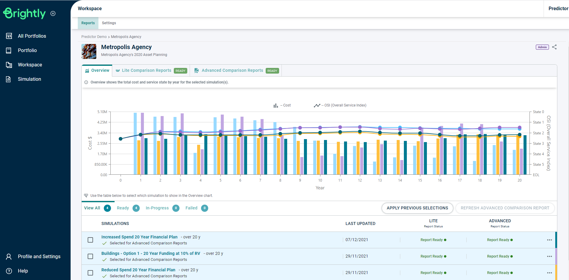
Once the Simulation is loaded, users can click on the 'Service Level Analysis' report in the Advanced Reports tab, under the Service Planning section, or use the Search Reports box to locate the correct report.
This will load the Service Level Analysis report in a new browser tab:
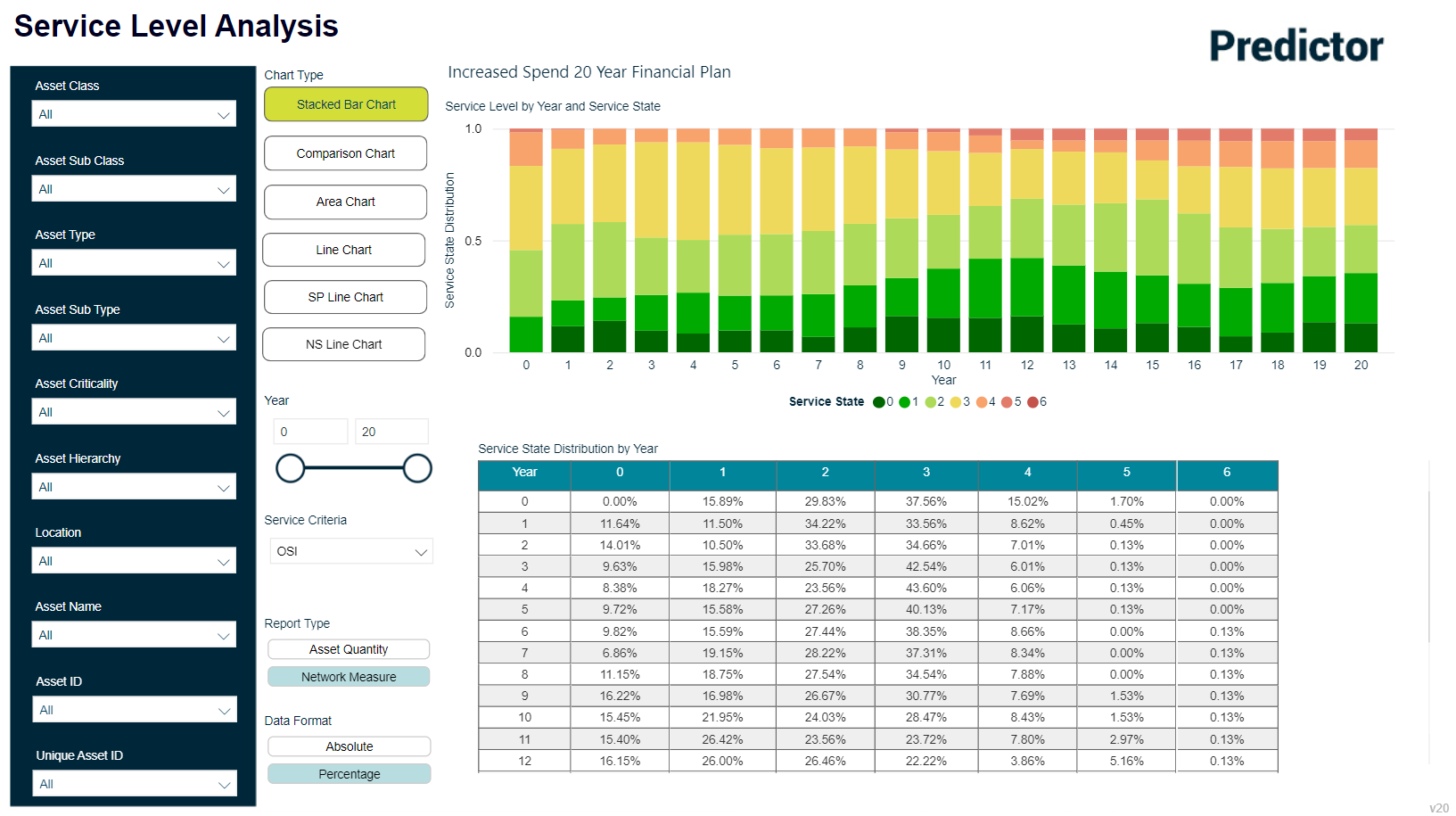
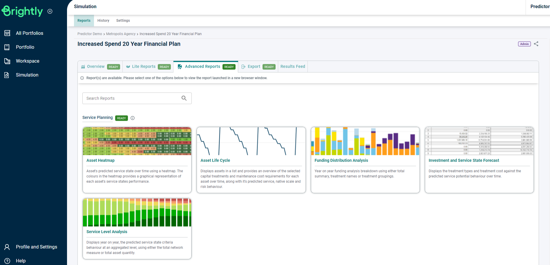
The Service Level Analysis report will display the Condition Distribution by Year, for each year of the simulation.
The type of graph displayed can be changed by selecting an option from the Chart Type section.
Available Chart Types include Stacked Bar Chart, Comparison Chart, Area Chart, Line Chart, Service Potential (SP) Line Chart and Native Scale (NS) Line Chart.
Users can modify the year range displayed by the report by moving the value slider, or by adjusting the year range value itself within the Year section.
The Report Type can also be changed to use either Asset Quantity or Network Measure, and the values displayed in the report can be changed to display as either an absolute value or as a percentage.